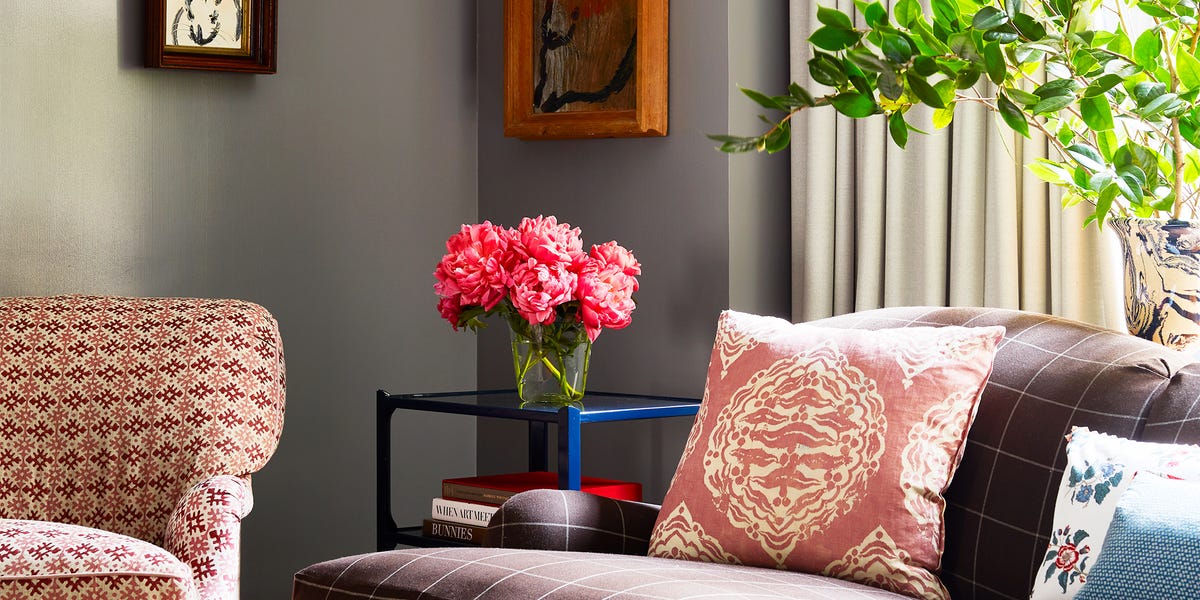
When it comes to living room design, a flattering color palette is one of the first aspects you need to nail down. It will likely drive the whole design scheme and set the mood for years to come. Plus, your living room is probably the most-used room in the house, so choosing colors that make you look forward to spending time in it is a must! Whether you want something bold and bright, neutral, or dark and moody, we’ve laid out tons of designer-approved living room paint color ideas to help you get inspired. All you have to do is put on your overalls and grab a roller—or, you know, hire someone else to do the dirty work. The hardest part will be deciding between all of these living room colors. But once you do, you can start shopping for the decor.
-
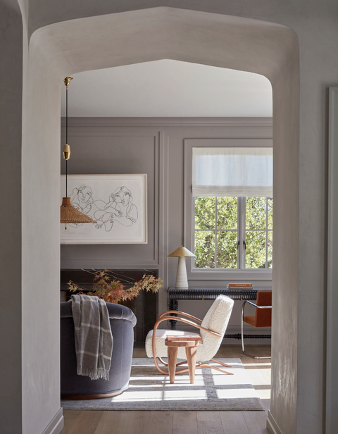
GRAY-PURPLE
In a Cape Cod-style home for a couple of empty nesters, designer Lauren Nelson painted the living room walls in Farrow & Ball’s Dove Tale—a warm gray with purple undertones. It keeps the atmosphere neutral yet inviting.
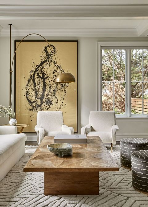
PEARL
A soft white paint with a slight gray tone to it can easily make your living room a spot you want to spend all day in. Take it from designer Sharon Rembaum, who dressed this living room with textured pieces in a neutral color palette to boost its overall coziness.
 TREVOR PARKER
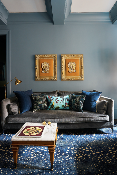
CERULEAN BLUE
Designer Garrow Kedigan made use of Lakeside Cabin by Benjamin Moore on the walls of this cozy corner. The faded cerulean blue acts as a soft backdrop to the rich orange and gold decor and dark gray sofa.
 Sean Litchfield
CLOUDY GREEN
Reminiscent of the outdoors and luxurious spas, sage green can instantly make your living room feel welcoming. In this speakeasy-inspired room by Brooklinteriors, Art Deco, Eastern World, and bohemian elements are blended together on a background of Clare’s Dirty Martini paint for an opulent but casual atmosphere.
 Alyssa Rosenheck
SUNNY YELLOW
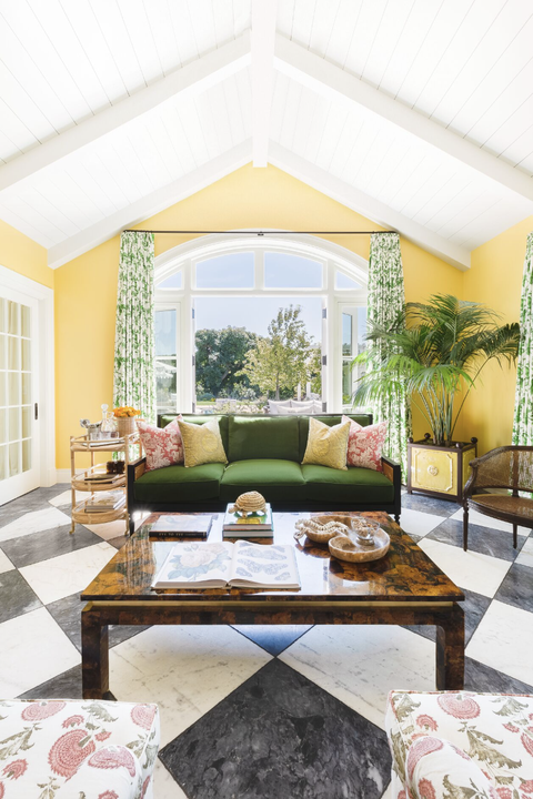
Sunny yellow walls can instantly brighten up your living room— no matter if you have big windows or small openings for natural light. In this room designed by Taylor Anne Interiors, Farrow & Ball’s Citron adds energy to the tropical-yet-modern space.
EBONY
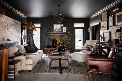
Set a moody yet cozy scene by painting your walls and ceiling in a soft shade of ebony. For designer Sean Anderson’s client, comfort and function in the living room were crucial for entertaining. He painted the room in Iron Ore by Sherwin-Williams and layered items that told the homeowner’s story to enhance the welcoming atmosphere.
RED CLAY
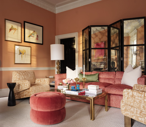
Designed by Melanie Turner, this living room’s walls are painted in Windswept Canyon by Sherwin-Williams. The assortment of furniture styles is united by a common colorway that pairs nicely with the paint.
FROST BLUE
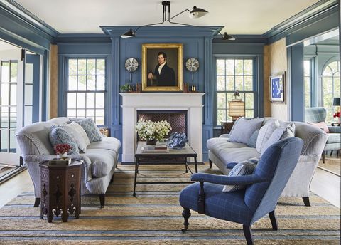
Frost blue walls—in Benjamin Moore’s Philipsburg Blue, to be exact—offer the right amount of softness in this formal dining room designed by Jenny Wolf. Gold framed art and a textured rug add warmth near the fireplace.
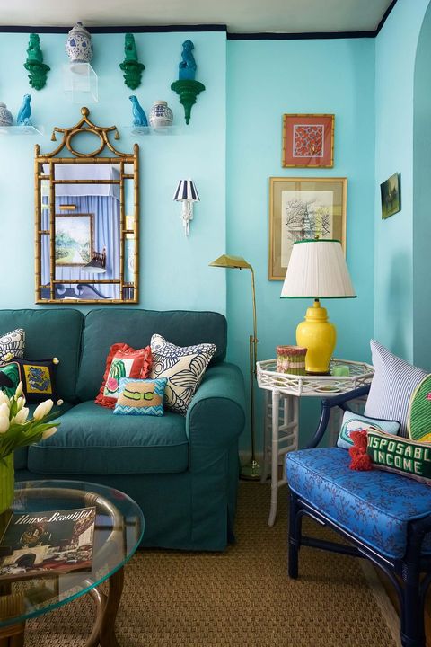
TEAL
“It’s a vibrant happy blue while not being too overwhelming, says designer Rudy Saunders of the color on the walls of his Upper East Side studio apartment. It’s Fine Paints of Europe Jefferson Blue from the Dorothy Draper paint collection.
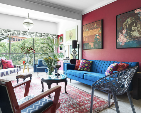
SANGRIA
Designer Krsnaa Mehta aimed for a salon feel in the heart of his India home. The sangria-and-blue palette of the living room achieves that inviting look that’s best suited for entertaining.
 Lisa Romerein
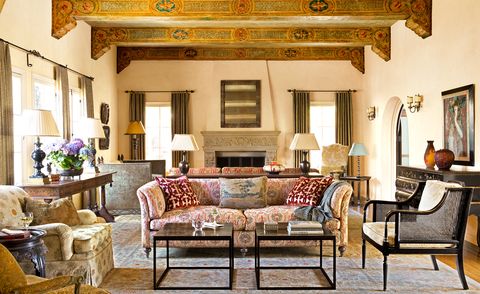
CREAM
This sunny living room designed by Thomas Callaway exudes warmth, despite the grand size and ceiling height. Callaway broke the room into zones to enhance intimacy and then used soft buttery glaze on the walls to give the room a golden glow, and layered rich yet mellow fabrics.
 Jared Kuzia Photography
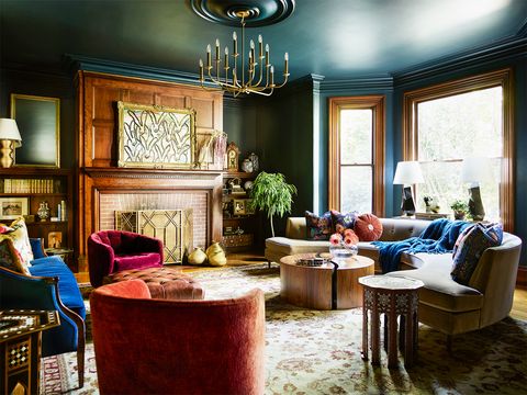
DARK BLUE-GREEN
Designer Cecilia Casagrande chose rich jewel tones for this Boston Colonial living room. It’s classic yet fresh. The paint color—Farrow & Ball Hague Blue—in particular, straddles that duality of modern and traditional styles, perfect for a historic home. Casagrande also mixed contemporary elements with more traditional ones to further play with that juxtaposition between old and new.
 Thijs de Leeuw/Space Content/Living Inside
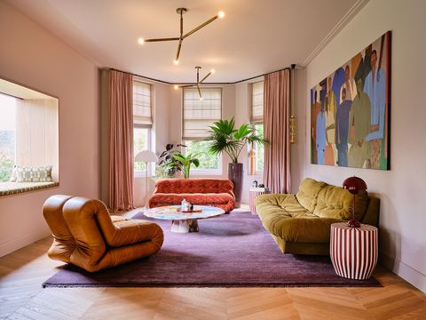
DUSTY ROSE
Atelier ND and homeowner Carice Van Houten used a variety of plant species to liven up the room and create visual intrigue with different heights and shapes. It really freshens up the bold pastels and rich earthy tones for a unique composition. Pro tip: Don’t forget to paint the ceiling for a more immersive impression.
 Anna Spiro Design
BUTTERCREAM
Instead of painting the walls blue, designer Anna Spiro covered the hardwood floors in a cheerful blue color. She also made the windows extra sunny by painting the frames buttercream yellow.
 Brie Williams
PITCH BLACK
Dark black walls and lots of warm gold and caramel tones make this living room designed by Ariene Bethea super cozy but also formal and regal—the ideal balance if your living room doubles as the family room. She used Tricorn Black by Sherwin-Williams.
 Kendall McCaugherty
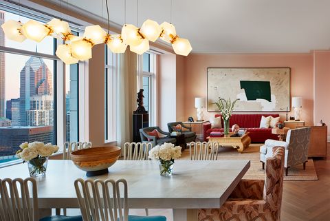
PEACH
The open floor plan in this Chicago family apartment designed by Bruce Fox called for cohesion between the dining and living room areas. That soft peachy paint and deep pink sofa are reflected in the printed armchair at the head of the dining table, and also mimic the rosy glow of the pendant light. The color scheme was inspired by a photograph taken of the family in London during spring when the city was veiled in cherry blossoms.
 Read McKendree
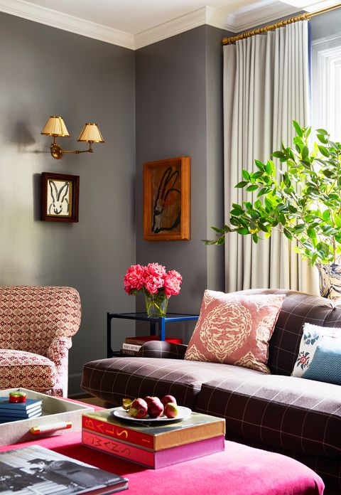
CLAY
Dark gray walls can be a bit brooding, like storm clouds, but in the case of this sunny Manhattan apartment by Elizabeth Cooper, they look playful and contemporary. Cheerful pinks, a dash of cobalt blue, traditional granny-chic patterns, and whimsical artwork lighten the mood.
 Nicole Franzen
OFF-WHITE
While bright colors can help liven up a room, it’s not the only route. Take this neutral-toned living room by Kristin Fine: Soft and texture-rich upholstery mix with off-white paint, rustic wood pieces, and plenty of antique accents to make a surprisingly modern impression with lots of character.
 Robert McKinley
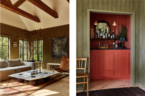
OLIVE
Robert McKinley wanted to keep the color scheme in this country retreat earthy and neutral but also wanted to inject it with a little warmth. He opted for a quietly sophisticated shade of olive green for the walls while the chose a cream color for the wood-paneled ceiling.
 Chris Mottalini
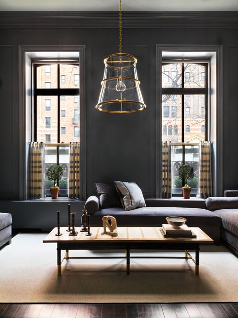
STEEL GRAY
This New York City living room designed by Nanette Brown is a lesson in dark paint decorating that strikes the balance between formal and casual, sophisticated and easy-going, elevated and cozy. The exact color pictured is Amethyst Shadow from Benjamin Moore.

